 |
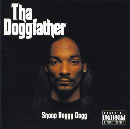
This album cover shows a close up of a young black man surrounded by a pitch black background while also wearing a dark top. The large text in the top left hand corner says ‘Tha Doggfather’ while below a parental warning. These show the genre characteristics of a hip-hop artist due to the pitch black background and slang used within the album title ‘tha’ also a parental warning which comes into place as rappers are known for using a lot of strong language in their music. The album cover also indicates how old it by showing the artist, as he has a perm which is an early 90s rapper look.
The demands of the record label make the artist on their first and some times second album cover to use a close-up so that we the audience recognise him/her as an artist, this creates public attention and generates sales.
The notion of looking portrays this album cover as a ‘dark album’ due to the pitch black background causing intimidation throughout the audience, making the artist seems dark and mysterious. We can have a good idea what the music will be like by having violent references and strong language.
The intertextual reference used within the album cover is its title ‘Tha Doggfather’ as its text and style is similar to the notorious gangster film ‘The Godfather’, this indicates that this album is all about ‘gangster rap’.

This next album from the following artists shows another close-up of the artist so we can recognise who he is also showing a parental warning. He is shown to be in black and white while his background is blue. The genre characteristics of this album cover is mainly his appearance as we can see he is a African American with cornrow this relates back to hip hop and R&B as not many of artists in other genres use this appearance. He also has a dollar diamond ear ring while also wearing a long diamond chain this relating back to hip-hop, as many rappers wear jewellery to look more rich and powerful.
The demands of the record label still rely on Snoop Dogg still using close ups so audiences can see who is and recognise who he is. This is used as a promotional device as you can see by his expensive jewellery since his last album he has turned into a successful artist who produces large sales so the record label demands him to still use close ups to give him representation and publicity they require.
The notion of looking revolves around the colour blue as this is the main theme on the album cover and is related in the album title “Tha Blue Carpet Treatment”.
The phrase "Blue Carpet" in the album's title references the red carpet used at formal events. The blue colour refers to Snoop Dogg's connection with the Los Angeles, Crips street gang who often wear blue and shun the red of their rival gang, Los Angeles, Bloods.

This album cover shows the genre characteristics of a young R&B group due to its typical use of three black women which is common factor in female R&B groups, also the use of bright colours we can tell the album contains a style of pop by their young trendy look also appearance, as their clothes are youthful and appealing.
The record label demands that the R&B group focus on showing all artists in a medium shot as one but not individually as this will appeal to the audience as they will know not one sings but all together. This creates public attention as an ideal R&B group causing album sales.
The album’s notion of looking is a hip young style of writing and colours which stand out also by their sense of teenage clothes.
The intertextual references are the teenage clothes and young influences for example the young female in the middle holds a giant baby bottle this indicating that she is a ‘big baby’.

The genre characteristics show again three black women which relates back to R&B as this is a normal factor of black female groups.
The demands of the record label focuses on the female group to be shown all in the album cover. The album cover also shows close ups of the whole group this allowing the audience to recognise the artists and creating a relationship between the group and audience this allowing the audience to listen to their music then buy their albums.
The notion of looking in this album cover is the theme of all red which blinds into the group, this creating a vibe of love as red creates the feeling of lust making it feel sexy. The audience can gain a good idea that the album is R&B and soul.
The intertextual reference used in this album is album title “Crazy Sexy Cool”, this is used to describe each member of the group as the title is used underneath their images to create a connection between themselves and the audience as they know the one on left hand side is ‘crazy’, middle ‘sexy’ and right hand side one ‘cool’.
Anthony at present this is too small for me to read can you please re- scale it, so it fits into your blog accordingly and it is legible to read.
ReplyDelete